Tools: Illustrator, Photoshop, + Adobe Stock
I began my internship at the University of Illinois' Office of the Vice Chancellor for Research & Innovation in March (a long title, I know.) Since then, I have leapt from project to project, utilizing a lot of different skills, connections, and styles. In my interview, I distinctly remember mentioning that my Photoshop skills were not up to par, but they have since grown exponentially thanks to this job and the tasks I have taken on in recent months.
I have been placed on a couple of projects and I've chosen to highlight the two main ones that have remained consistent over the past seven months: the "Stamps" and our Illustration Library.

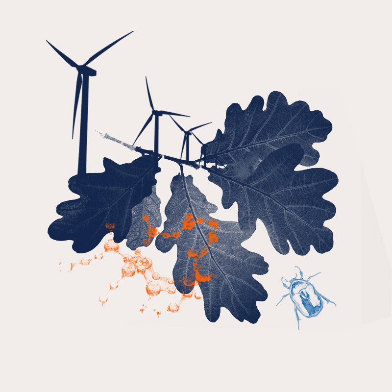
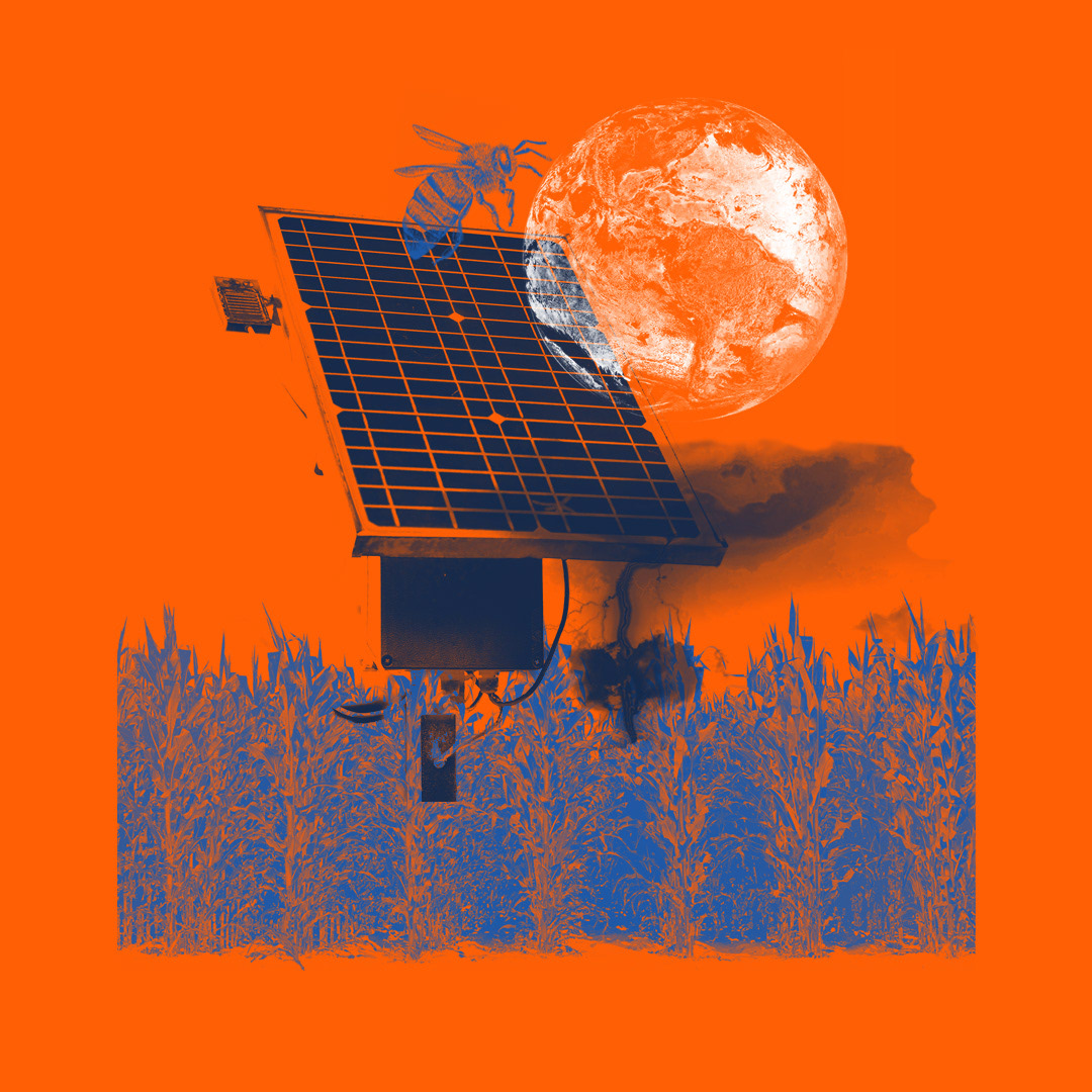
The Stamps:
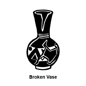
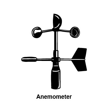
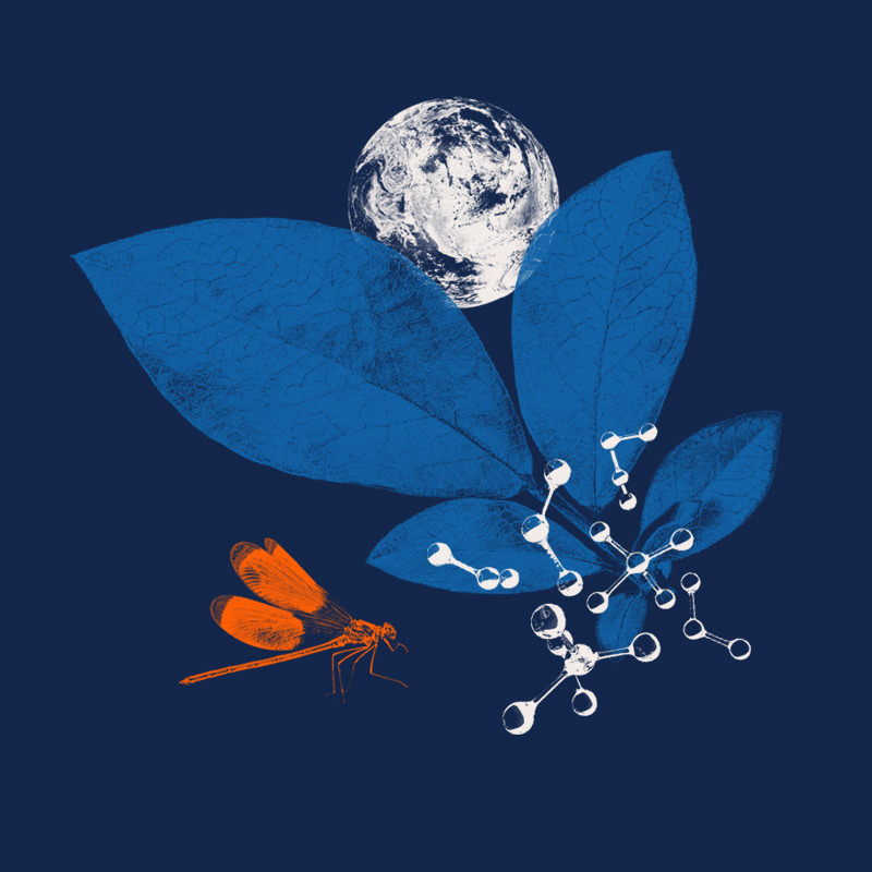
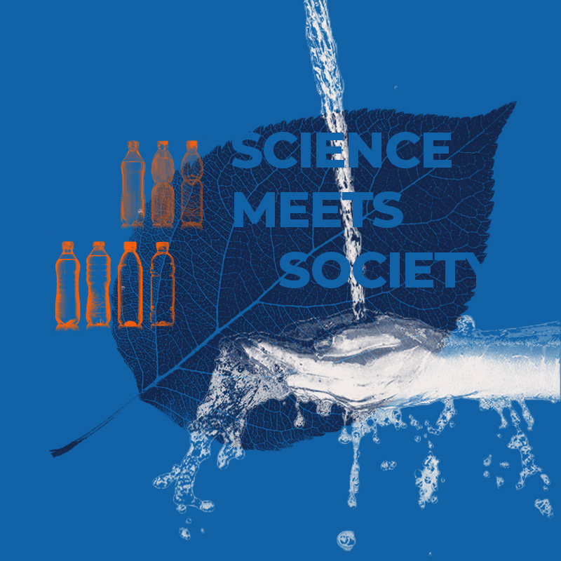
This is a project I was assigned to at the beginning of the summer and have been continuing with since. These are developed from existing images taken from the University's image database or Adobe Stock. Essentially, they are created by selecting various color values of a subject and deleting them, leaving behind shadows; from there, they would be colored into a single fill and overlayed atop each other in a collage style.
We started calling them "stamps" because of the characteristics they share with blocks that are hand carved and inked over with spots of chatter and the unevenness.


Currently, this is the library of assets that we are working with. Each of these images falls in line with a subject or interest of each of the research institutes on campus with the intention of them being able to utilize it as a visual element with their content. This library continues to be subject to change as newer and better images come into play, replacing certain categories or things we may see that could be done as vectors.


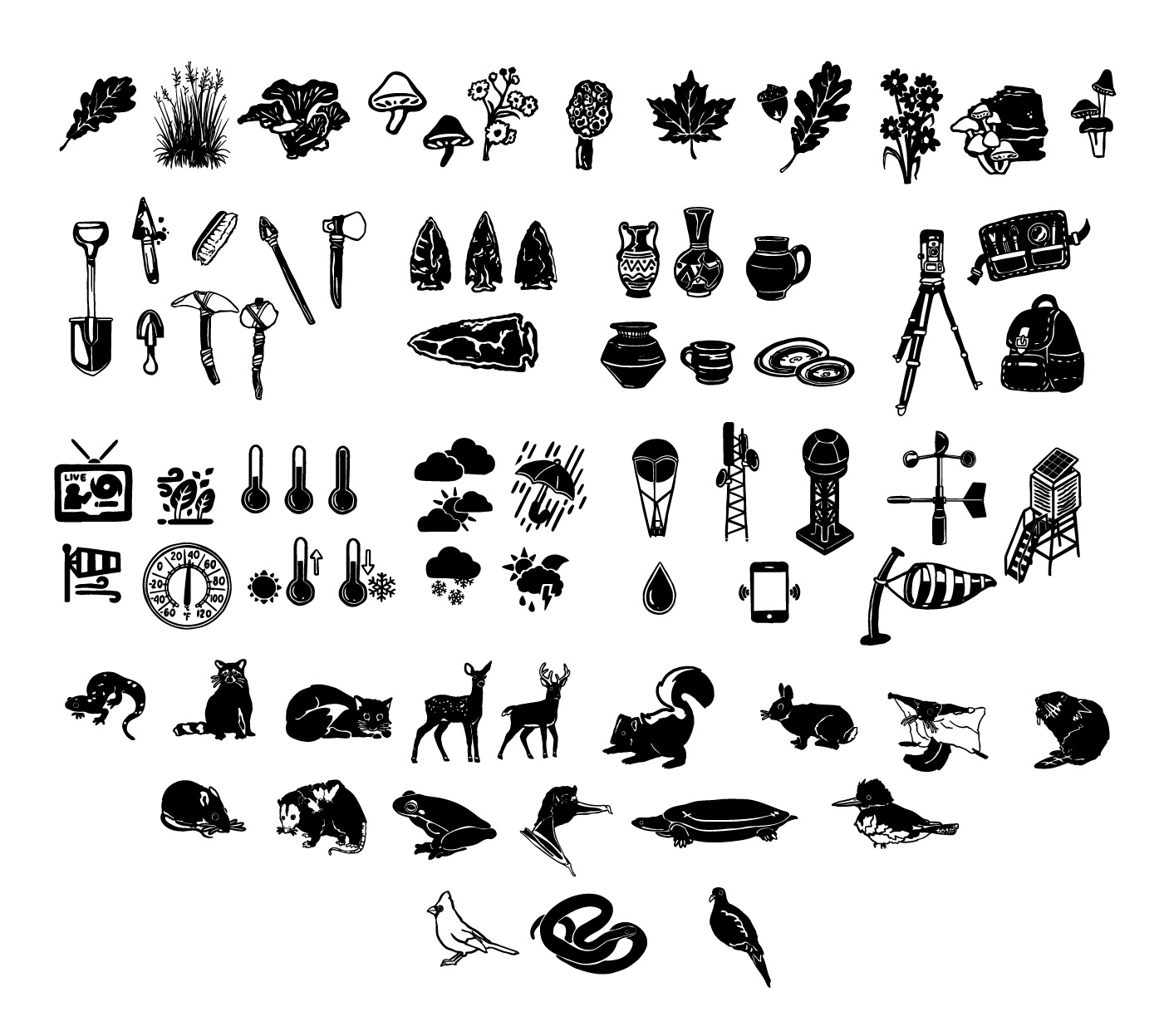
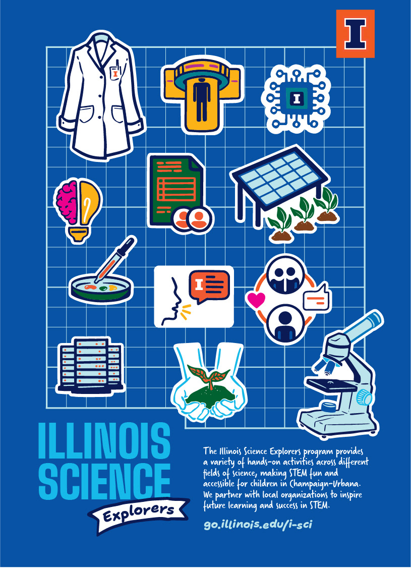
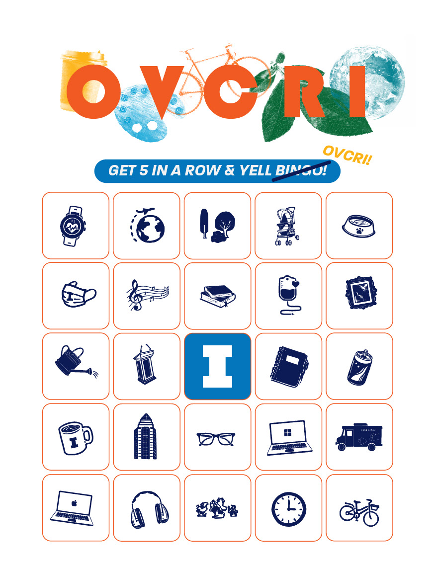
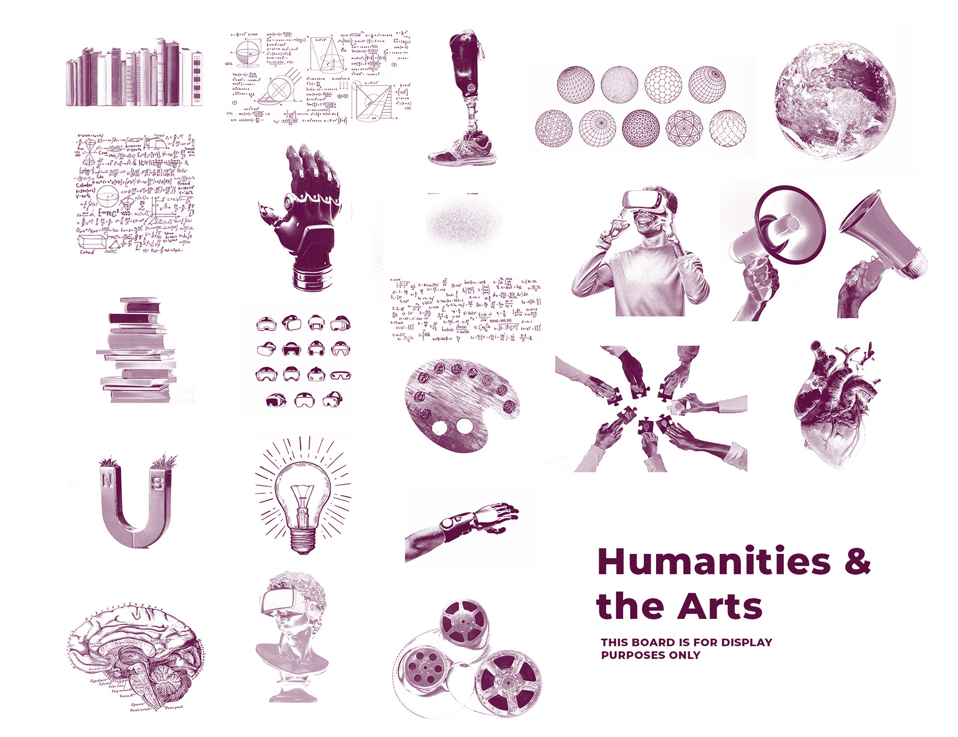
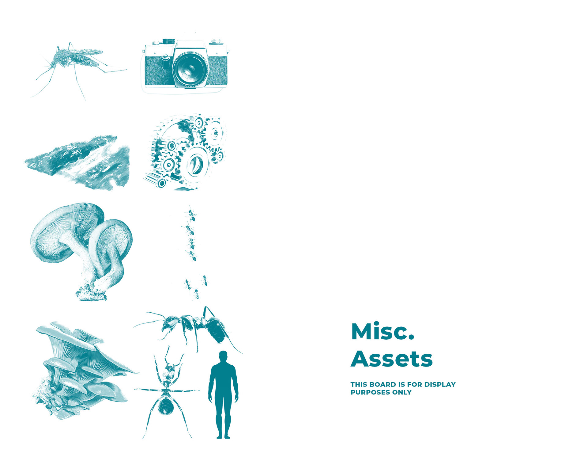
The Illustration Library:
This project has been a long time in progress, being passed down from past graphic design interns. These illustrations, or we also refer to them as icons, are primarily used as background elements or in place of images on various things, such as nametags, posters, etc. with the purpose of giving them a more personal, creative feel.
The image on the right features a standardized view of the illustrations that had been completed prior to me by the past intern, and as this became my side job, I was casually assigned categories based on the Institutes to create for with the idea of replicating the same style across them.
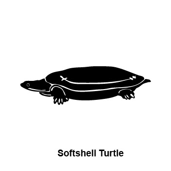
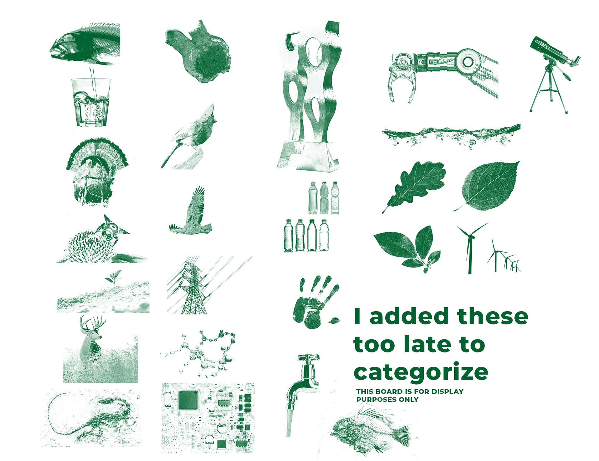
The image below features the illustrations I have currently developed, including some of my favorites (like the soft shell turtle.)